Wednesday, 26 November 2014
Collaboration with Roxanne Coombs
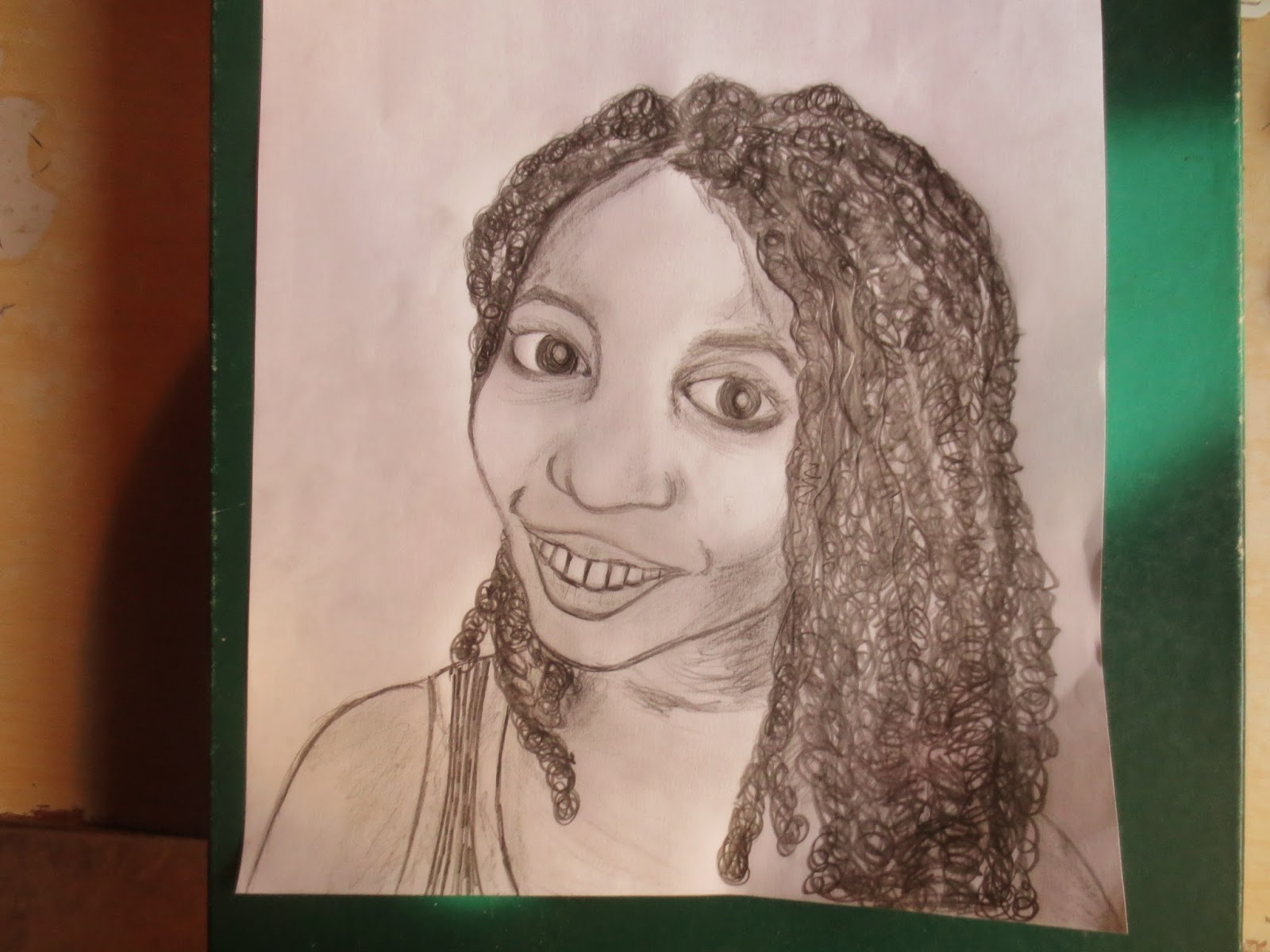
My collaboration with Roxanne Coombs was one of her interviewing me about my art work, and I did this illustration of a portrait picture of her. Roxanne is doing the blog "Things that Annoy & Things to Enjoy".
Saturday, 22 November 2014
The Artist's Shoes: "Ghost Ranch"
The "Artist's Shoes" was a research project in my Colour Theory course. An Artist was to be researched and a shoe was to be choosen that best represents the artist, and to be painted on to best reflect the particular artist style. My artist choosen was Georgia O'keeffe. I represented her style of charcoal abstract to the back of my shoe; to the middle, I represented her paintings of enlarged blossoms; and to the front of my shoe, I represented her tall buildings showing perspective which were done usuallly with a night background.
I then presented my shoes on sand with stones and wood, because it represents where Georgia spent the last years of her life, her favourite place, which gave her a lot of inspiration for many of her paintings , "Ghost Ranch" in Santa Fe, New Mexico.
Friday, 14 November 2014
Collaboration with Donna-Mae Clarke
Donna-Mae Clarke is a full time art teacher, artist,
wife and mother of three children.She is involved in the
arts both visual and performing .I was very
honoured to have her critique my Graphic
Design movie poster.Here is what she has to say.
The poster ‘Count Blackula’ advertises a
Trinidad
spoof film on the movie ‘Count Dracula’. The colour scheme used was reds,
black and white.The title of
the movie is very animated with the teeth forming
the
letter ’C’ in the word Count. The negative space in the middle provides
breathing space for the heading at the
top and sub heading at the bottom. The use of the
textured back ground works
well with the heavy dripping red blood and the horizontal striped foreground.
The focal point of the two vertically
standing couple is effective because of the solid black of the suit on
the male figure,
this acts as a good background to highlight the coloured
patterned dress of the female figure. This poster is an effective design capturing
the message of the movie which is a comic version of the scary old theme of
Count Dracula with a Trini flavour.
Collaborative Project with Allison Padilla-Alexander comparison with creativity in Fine Art and graphic design
Collaborative Project with Allison Padilla-Alexander comparison with creativity in Fine Art and graphic design
I (Donna Clarke) interviewed Allison Padilla-Alexander as part of my blog project to highlight creativity around us. She is a blend of an aspiring fine artist/ craftswoman and a young graphic designer. A common perception has been that creativity is different in the different art forms but as Allison correctly identifies creativity is one and the same to every artform, it is just the medium that is different.
Here is how the interview went:
What is your involvement with the arts? My involvement with the arts is represented by my drawings, craft projects and Graphic Designs using the computer.
Where do you get your creative ideas from to do your artwork?
I get my creative ideas for my artwork by brain storming, drawing thumb nails and sometimes by observing the environment and taking time to notice the unknown.
What do you think creativity is to a visual artist?
I think that creativity to a visual artist is much more than just seeing, it is more about forming and picturing an image in your mind and being able to execute the image in the way in which you visualize it.
What are the main differences if any between the creativity of a fine artist (drawing and painting) and a graphic designer?
I don't think there are any differences between a fine artist and a graphic designer’s creativity.The difference would stem from the different media by which they execute their artwork.
Do you as an artist think that creativity is any better achieved in any artform such as design vs a painter or dancer or musician?
I think that creativity has no limit. One can be critical of a piece of artwork from a designer or a painter, some might say that one is better than the other but that is a matter of personal preference and it is up to the eyes of the beholder to acknowledge the true creativity of the artists.
Saturday, 8 November 2014
Black and White
In this illustration, I tried to play with positive and negative space. I love how the combination of black and white goes well together. It reminds me of the concept of yinyang, which expresses the interchange and interplay of two opposing components, most times opposite in nature, but rely on each other. Yinyang exists in everything. The pairs can exist as in the moon and sun, cold and hot, passive and active, dark and bright, male and female... Here I expressed it on a leaf. You can look at it as a simple black and white leaf; or you can look at it as something more.
Friday, 7 November 2014
Floral Prints
Flowers are everywhere. They are beautiful, diverse and amazing. There are about 352,000 species of flowers throughout the world. This week I am expressing my love of flowers in art. I am excited to show off this brilliant arrangement of some very simple flowers in a simple pattern.
Here is my random floral abstract prints. This floral design is drawn on paper, using Prisma color pencils. The brillant colours made the flowers look as if they would pop right out of the paper.
Saturday, 1 November 2014
Snow White
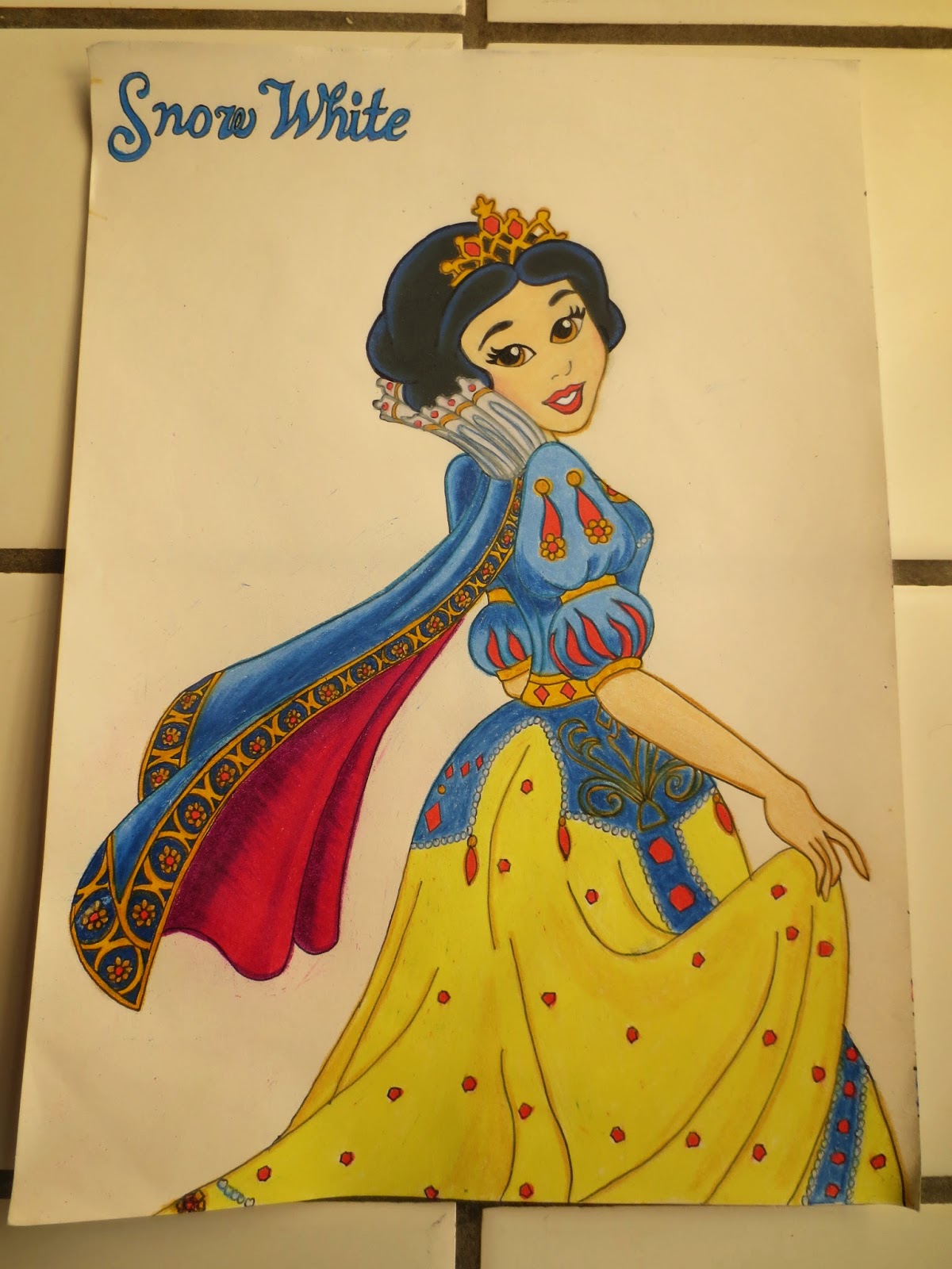
Hi everyone, since I am posting my doll dresses this week I have decided to do a drawing of Snow White - one of Disney's princesses and one of my favourite princess character. The first picture shows Snow White illustrated in animated black and white. The second one shows the coloured version which was completed using Prisma colour pencils.
Subscribe to:
Posts (Atom)


